
Zoom Prism Design System
Founded and developed a cohesive, flexible, and scalable design system that empowers Zoom to design and build faster, enhances user experience, ensures brand consistency, supports cost-efficient growth, and spans mobile, web, desktop, and AI platforms.

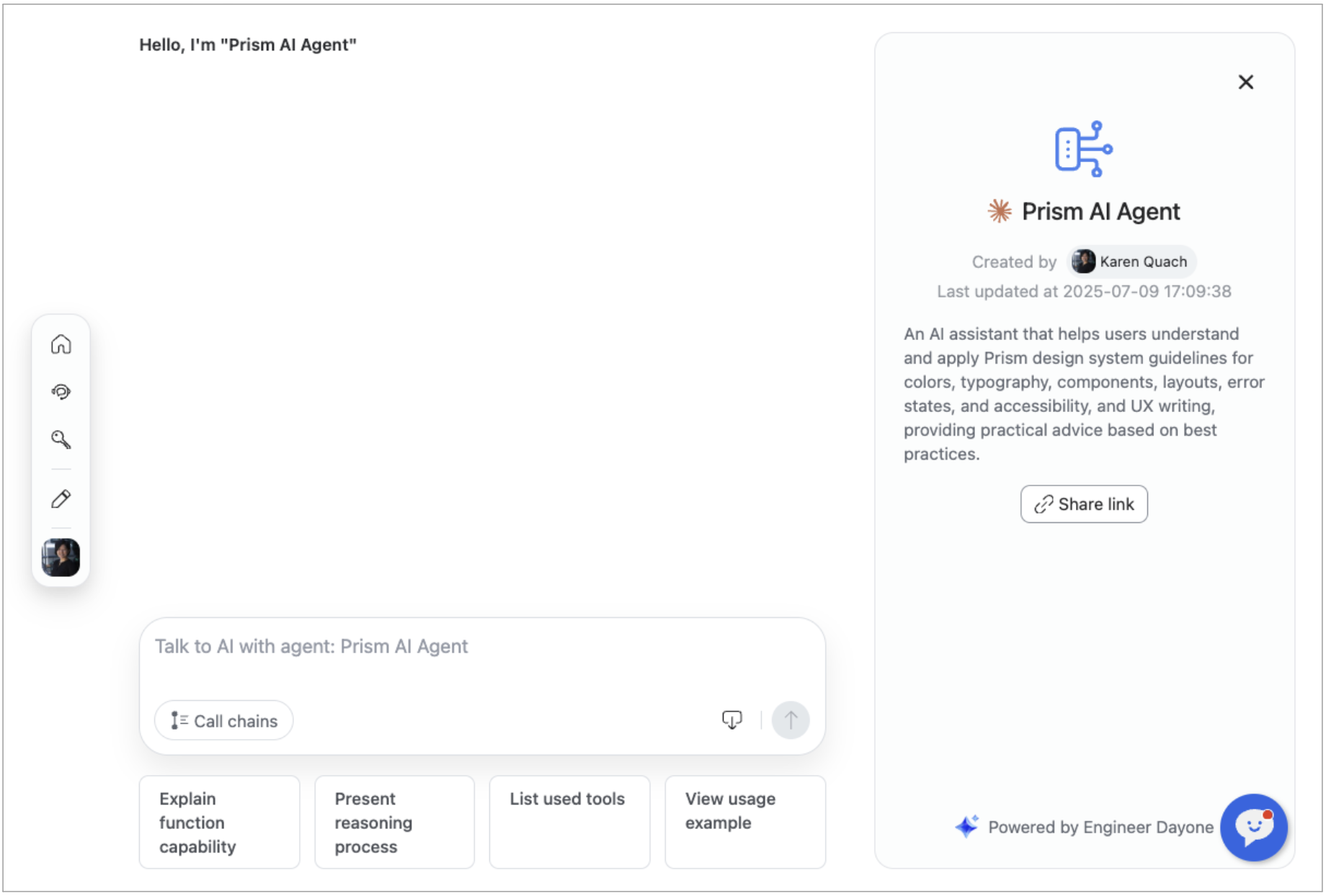
Prism AI Agent for Self-Service
Built an AI-powered agent that supports the design system, research, and content creation, with the ability to automatically generate content in Zoom’s tone and voice. Integrated directly into Figma, the Prism site, and Zoom Chat, it provides a convenient, on-demand resource that streamlines workflows, boosts productivity, and saves teams at least 40% of their time.
Prism Knowledge Hub
Provides designers and engineers with centralized access to comprehensive guidelines, usage standards, and code libraries, ensuring consistent, efficient, and high-quality design and development across projects. This centralized hub streamlines collaboration and empowers teams to build faster, smarter, and more cohesive products.

Templates for Zoom Ecosystem Across Platforms
Spearheaded a comprehensive cross-platform component library, page templates, and key product screens to drive 100% Prism adoption, modernize the user experience, and accelerate development. The system provides flexible, scalable UI components that unify and support the entire Zoom ecosystem across platforms, reinforce design consistency, reduce rework, and streamline cross-functional collaboration, enabling the creation of high-quality, scalable mobile applications.


Unified Component Library
A central collection of reusable UI components that brings the Prism Design System to life. These components enable product teams to build faster, maintain consistency, and collaborate seamlessly, while reducing redundancy and supporting scalable, high-quality experiences across platforms.
